Framework
Theme
All
689
Forms
16
Charts
21
Navbars
45
Sidebars
27
Typography
42
Components
62
Tables
34
Cards
70
Contact Us
9
Testimonials
19
General
6
Features
25
Cards Section
38
Teams Section
11
Faq
9
Headers
47
Blogs
15
Contacts Section
9
Profiles Section
13
Charts Section
7
Tables Section
15
Contents
18
Logo Areas
12
Projects Section
14
Stats
13
Authentication
15
Call To Actions
21
Http Codes
6
Teams
16
Pricing
13
UI Components Library
Discover 689 components available in Loopple’s library! Create modern templates without creativity of a designer
Section Teams Simple
Component from
Argon Dashboard
Builder
<div class="row removable">
    <div class="col-xl-3 col-md-6 drop-zone">
        <div class="card card-stats draggable" draggable="true">
            <!-- Card body -->
            <div class="card-body">
                <div class="d-flex align-items-center">
                    <div>
                        <img src="https://demos.creative-tim.com/argon-dashboard-pro-bs4/assets/img/theme/team-1.jpg" class="avatar avata-sm rounded-circle">
                    </div>
                    <div class="ml-3">
                        <span class="h4 font-weight-bold mb-0">Alex Mirrial</span>
                        <h6 class="card-title text-uppercase text-muted mb-0">CEO</h6>
                    </div>
                </div>
            </div>
        </div>
    </div>
    <div class="col-xl-3 col-md-6 drop-zone">
        <div class="card card-stats draggable" draggable="true">
            <!-- Card body -->
            <div class="card-body">
                <div class="d-flex align-items-center">
                    <div>
                        <img src="https://demos.creative-tim.com/argon-dashboard-pro-bs4/assets/img/theme/team-2.jpg" class="avatar avata-sm rounded-circle">
                    </div>
                    <div class="ml-3">
                        <span class="h4 font-weight-bold mb-0">Miriam Jockson</span>
                        <h6 class="card-title text-uppercase text-muted mb-0">CTO</h6>
                    </div>
                </div>
            </div>
        </div>
    </div>
    <div class="col-xl-3 col-md-6 drop-zone">
        <div class="card card-stats draggable" draggable="true">
            <!-- Card body -->
            <div class="card-body">
                <div class="d-flex align-items-center">
                    <div>
                        <img src="https://demos.creative-tim.com/argon-dashboard-pro-bs4/assets/img/theme/team-3.jpg" class="avatar avata-sm rounded-circle">
                    </div>
                    <div class="ml-3">
                        <span class="h4 font-weight-bold mb-0">Alice Kambell</span>
                        <h6 class="card-title text-uppercase text-muted mb-0">Full-Stack Developer</h6>
                    </div>
                </div>
            </div>
        </div>
    </div>
    <div class="col-xl-3 col-md-6 drop-zone">
        <div class="card card-stats draggable" draggable="true">
            <!-- Card body -->
            <div class="card-body">
                <div class="d-flex align-items-center">
                    <div>
                        <img src="https://demos.creative-tim.com/argon-dashboard-pro-bs4/assets/img/theme/team-4.jpg" class="avatar avata-sm rounded-circle">
                    </div>
                    <div class="ml-3">
                        <span class="h4 font-weight-bold mb-0">Johanna Sielle</span>
                        <h6 class="card-title text-uppercase text-muted mb-0">Front-End Developer</h6>
                    </div>
                </div>
            </div>
        </div>
    </div>
</div>
Section Teams Contact

Section Teams Social Links

Navbar White With Logo
Http Code With Text In The Left And Image On The Right

Team Section With Profile Cards

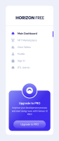
Sidebar Simple
Component from
Horizon UI Dashboard
Builder
/* eslint-disable */
import React from 'react';

import { Link } from "react-router-dom";
import { HiX } from "react-icons/hi";

// Icon Imports
import {
  MdHome,
  MdOutlineShoppingCart,
  MdBarChart,
  MdPerson,
  MdLock,
} from "react-icons/md";

const Sidebar = ({ open, onClose }) => {

  const routes = [
    {
      name: "Main Dashboard",
      path: "default",
      icon: <MdHome className="h-6 w-6" />,
    },
    {
      name: "NFT Marketplace",
      path: "nft-marketplace",
      icon: <MdOutlineShoppingCart className="h-6 w-6" />,
      secondary: true,
    },
    {
      name: "Data Tables",
      icon: <MdBarChart className="h-6 w-6" />,
      path: "data-tables",
    },
    {
      name: "Profile",
      path: "profile",
      icon: <MdPerson className="h-6 w-6" />,
    },
    {
      name: "Sign In",
      path: "sign-in",
      icon: <MdLock className="h-6 w-6" />,
    },
    {
      name: "RTL Admin",
      path: "rtl",
      icon: <MdHome className="h-6 w-6" />,
    },
  ];

  return (
    <div
      className={`sm:none duration-175 linear fixed !z-50 flex min-h-full flex-col bg-white pb-10 shadow-2xl shadow-white/5 transition-all dark:!bg-navy-800 dark:text-white md:!z-50 lg:!z-50 xl:!z-0 ${
        open ? "translate-x-0" : "-translate-x-96"
      }`}
    >
      <span
        className="absolute top-4 right-4 block cursor-pointer xl:hidden"
        onClick={onClose}
      >
        <HiX />
      </span>

      <div className={`mx-[56px] mt-[50px] flex items-center`}>
        <div className="mt-1 ml-1 h-2.5 font-poppins text-[26px] font-bold uppercase text-navy-700 dark:text-white">
          Horizon <span class="font-medium">FREE</span>
        </div>
      </div>
      <div class="mt-[58px] mb-7 h-px bg-gray-300 dark:bg-white/30" />
      {/* Nav item */}

      <ul className="mb-auto pt-1">
        { routes.map((route, index) => {
              return (
                <Link key={index} to="">
                  <div className="relative mb-3 flex hover:cursor-pointer">
                    <li
                      className="my-[3px] flex cursor-pointer items-center px-8"
                      key={index}
                    >
                      <span
                        className={`${
                          index === 0
                            ? "font-bold text-brand-500 dark:text-white"
                            : "font-medium text-gray-600"
                        }`}
                      >
                        {route.icon ? route.icon : <DashIcon />}{" "}
                      </span>
                      <p
                        className={`leading-1 ml-4 flex ${
                          index === 0
                            ? "font-bold text-navy-700 dark:text-white"
                            : "font-medium text-gray-600"
                        }`}
                      >
                        {route.name}
                      </p>
                    </li>
                  </div>
                </Link>
              );

          })
        }


      </ul>

      {/* Free Horizon Card */}
      <div className="flex justify-center">
         <div className="relative mt-14 flex w-[256px] justify-center rounded-[20px] bg-gradient-to-br from-[#868CFF] via-[#432CF3] to-brand-500 pb-4">
          <div className="absolute -top-12 flex h-24 w-24 items-center justify-center rounded-full border-[4px] border-white bg-gradient-to-b from-[#868CFF] to-brand-500 dark:!border-navy-800">
            <svg
              width="41"
              height="41"
              viewBox="0 0 41 41"
              fill="none"
              xmlns="http://www.w3.org/2000/svg"
            >
              <path
                d="M10.0923 27.3033H30.8176V36.3143H10.0923V27.3033Z"
                fill="white"
              />
              <path
                d="M31.5385 29.1956C31.5385 26.2322 30.3707 23.3901 28.2922 21.2947C26.2136 19.1992 23.3945 18.022 20.4549 18.022C17.5154 18.022 14.6963 19.1992 12.6177 21.2947C10.5392 23.3901 9.37143 26.2322 9.37143 29.1956L20.4549 29.1956H31.5385Z"
                fill="white"
              />
              <path
                fill-rule="evenodd"
                clip-rule="evenodd"
                d="M20.5 31.989C26.8452 31.989 31.989 26.8452 31.989 20.5C31.989 14.1548 26.8452 9.01099 20.5 9.01099C14.1548 9.01099 9.01099 14.1548 9.01099 20.5C9.01099 26.8452 14.1548 31.989 20.5 31.989ZM20.5 41C31.8218 41 41 31.8218 41 20.5C41 9.17816 31.8218 0 20.5 0C9.17816 0 0 9.17816 0 20.5C0 31.8218 9.17816 41 20.5 41Z"
                fill="white"
              />
            </svg>
          </div>

          <div className="mt-16 flex h-fit flex-col items-center">
            <p className="text-lg font-bold text-white">Upgrade to PRO</p>
            <p className="mt-1 px-4 text-center text-sm text-white">
              Improve your development process and start doing more with Horizon UI
              PRO!
            </p>

            <a
              target="blank"
              className="text-medium mt-7 block rounded-full bg-gradient-to-b from-white/50 to-white/10 py-[12px] px-11 text-center text-base text-white hover:bg-gradient-to-b hover:from-white/40 hover:to-white/5 "
              href="https://horizon-ui.com/pro?ref=live-free-tailwind-react"
            >
              Upgrade to PRO
            </a>
          </div>
        </div>
      </div>

      {/* Nav item end */}
    </div>
  );
};

export default Sidebar;
